Process Overview Custom Dashboards
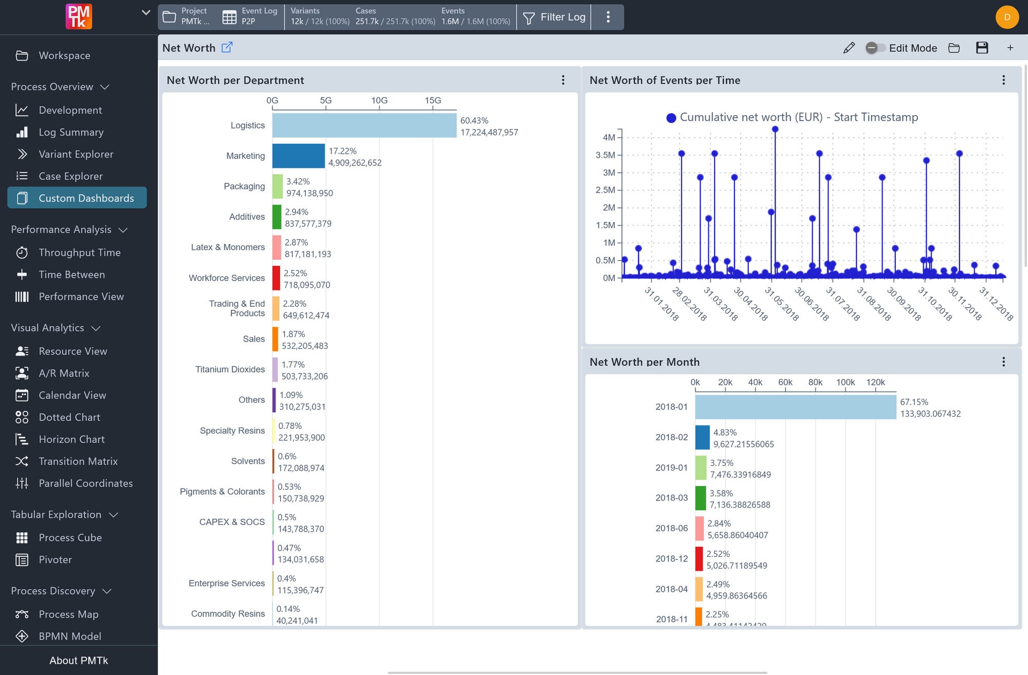
Screenshot shows a Custom Dashboard named Net Worth, containing three chart tiles: a Bar Chart showing net worth per spend area and a Line Chart showing cumulative net worth on event completion over time, and a Bar Chart showing the mean net worth per month.
Custom Dashboards allow you to build personalized analysis views by arranging and configuring chart tiles on a free-form canvas. Each dashboard can be saved, named, and reloaded independently, making it possible to maintain dedicated dashboards for different analytical needs or audiences. Currently supported chart types are Bar Chart and Line Chart.
Managing Dashboards
The toolbar at the top of the page provides the following controls:
| Control | Description |
|---|---|
| Save | Saves the current dashboard layout and configuration under a chosen name. |
| Load | Opens a previously saved dashboard. |
| Create New Dashboard | Creates a new empty dashboard. |
| Autosave | When enabled, any changes to the dashboard are saved automatically without requiring a manual save. |
| Edit Mode | Toggles between edit and view mode. In view mode, the tile panel and all configuration controls are hidden, tiles cannot be moved or resized, and the dashboard is presented in a clean read-only layout. |
| Edit Title | Change the name of the dashboard. |
Bar Chart
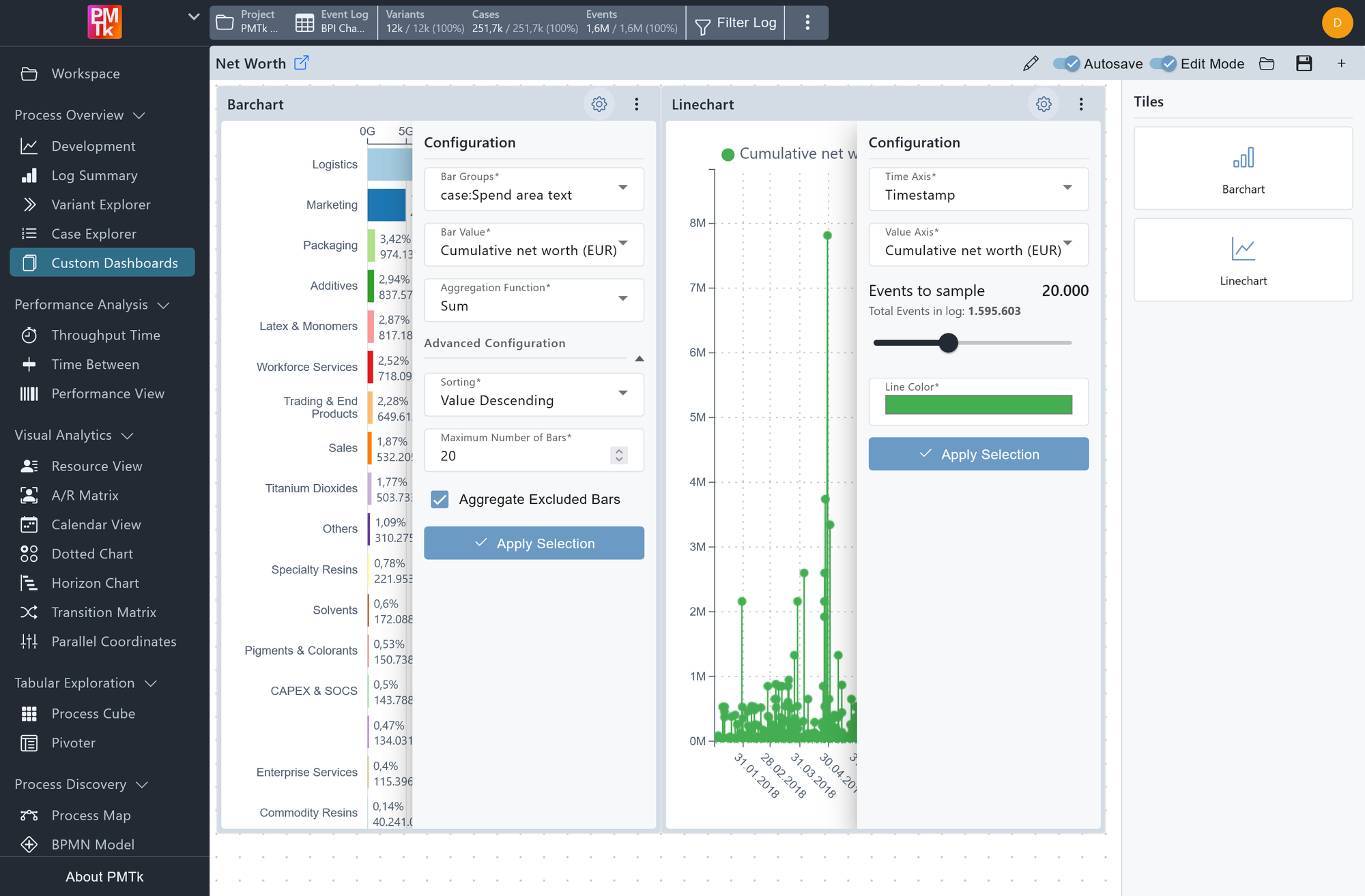
Screenshot shows the same Custom Dashboard with both chart configuration panels open.
The Bar Chart displays a ranked set of groups along the vertical axis with a measured value along the horizontal axis, making it suited for comparing aggregated metrics across categories.
Configuration
| Setting | Description | Values |
|---|---|---|
| Bar Groups | The attribute whose distinct values form the individual bars. Both case-level and event-level attributes are supported. |
|
| Bar Value | The numeric attribute to aggregate for each group. Available options depend on whether a case-level or event-level attribute is selected for Bar Groups. |
|
| Aggregation Function | How the Bar Value is computed per group. |
|
Advanced Configuration
| Setting | Description | Values |
|---|---|---|
| Sorting | Controls the order in which bars are displayed. |
|
| Maximum Number of Bars | Limits how many bars are rendered. Groups beyond this limit are either hidden or aggregated depending on the setting below. |
|
| Aggregate Excluded Bars | When enabled, all groups that fall outside the maximum bar limit are combined into a single additional bar rather than being omitted entirely. |
|
Click Apply Selection to apply any configuration changes to the chart.
Line Chart
The Line Chart plots a numeric value over time, making it suited for tracking how a metric evolves across the recorded timeframe.
Configuration
| Setting | Description | Values |
|---|---|---|
| Time Axis | The attribute used for the horizontal time axis. Both case-level attributes (e.g. Case Start) and event-level attributes (e.g. Timestamp / Event End) are supported. |
|
| Value Axis | The numeric attribute plotted on the vertical axis. If a case-level attribute is selected for the Time Axis, only case-level attributes are available here. Similarly, event-level Time Axis selections restrict the Value Axis to event-level attributes. |
|
| Events to Sample | A slider controlling how many events are included in the chart. The total number of events in the log is shown for reference. |
|
| Line Color | Sets the color of the plotted line. |
|
Click Apply Selection to apply any configuration changes to the chart.
