Visual Analytics Dotted Chart
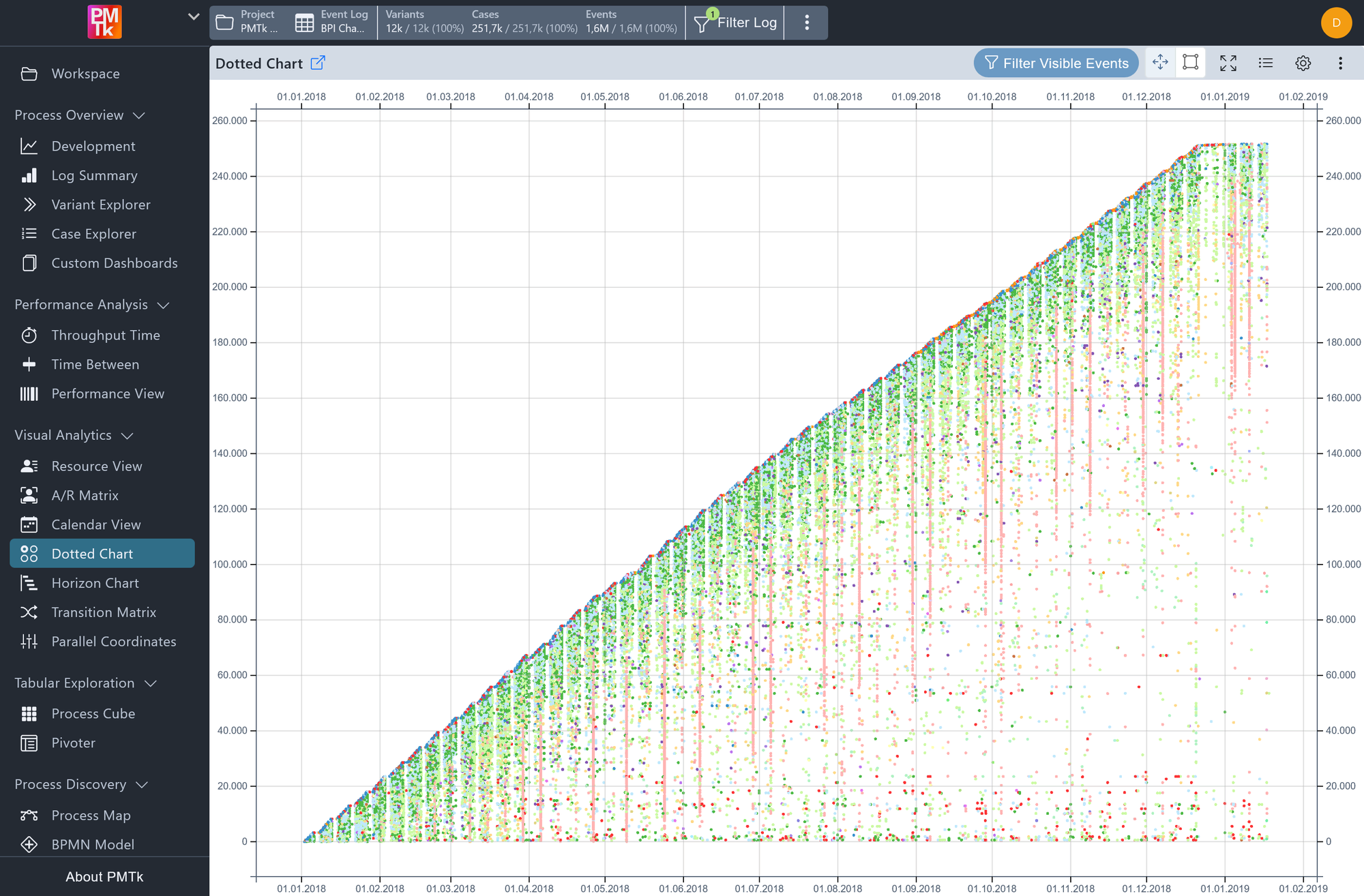
Screenshot shows the Dotted Chart visualizing 100,000 sampled events from a BPI Challenge event log. Each dot represents a single event, positioned by its completion time on the horizontal axis and its Case Index on the vertical axis, and colored by activity lifecycle. The triangular shape of the dot cloud reflects the gradual accumulation of cases over the recorded timeframe.
The Dotted Chart provides an event-level scatter plot of the event log, rendering up to 100,000 sampled events as individual colored dots. The horizontal axis represents the completion time of each event, while the vertical axis represents the Case Index, i.e., a normalized integer identifier assigned to cases in the order they arrive (the first case to start receives index 1, the second receives index 2, and so on).
This view is particularly effective for spotting high-level patterns across the entire log at a glance: the overall shape of the dot cloud can reveal how case throughput evolves over time, whether cases tend to cluster or spread out, and how different activity types or other attributes are distributed across the process timeline. Clicking on any individual dot opens a tooltip with detailed information about that event, including its Case ID, activity name, and other relevant attributes.
Dotted Chart Toolbar
The toolbar above the chart provides controls for navigating and interacting with the plot. Besides the standard controls found in all dashboards (like configuration toggle or chart download in ), the exclusive ones from left to right are:
| Control | Description |
|---|---|
| Filter Visible Events | Applies a filter retaining only the events whose completion time and Case Index fall within the currently visible axis ranges. Useful for drilling into a specific region of the chart. Applies a Dotted Chart Filter globally, restricting all downstream analyses and views to the selected date range. |
| Pan | Switches to pan mode, allowing you to click and drag to move around the chart. |
| Select | Switches to selection mode, allowing you to draw a rectangular selection over a region of the chart. |
| Autoscale | Resets the axis ranges to fit all visible events, returning to the full overview. |
| Toggle Legend | Shows or hides the color legend for the currently selected attribute coloring. |
Dotted Chart Configuration
The configuration panel provides the following options.
| Setting | Description | Values |
|---|---|---|
| Sorting | Controls the order in which case are sorted in the chart. |
|
| Attribute Color | Determines the attribute used to color the dots. |
|
| Show Tooltips | When enabled, clicking on a dot displays a tooltip with detailed information about that event, such as its Case ID, activity name, and other associated attributes. |
|
