Performance Analysis Performance View
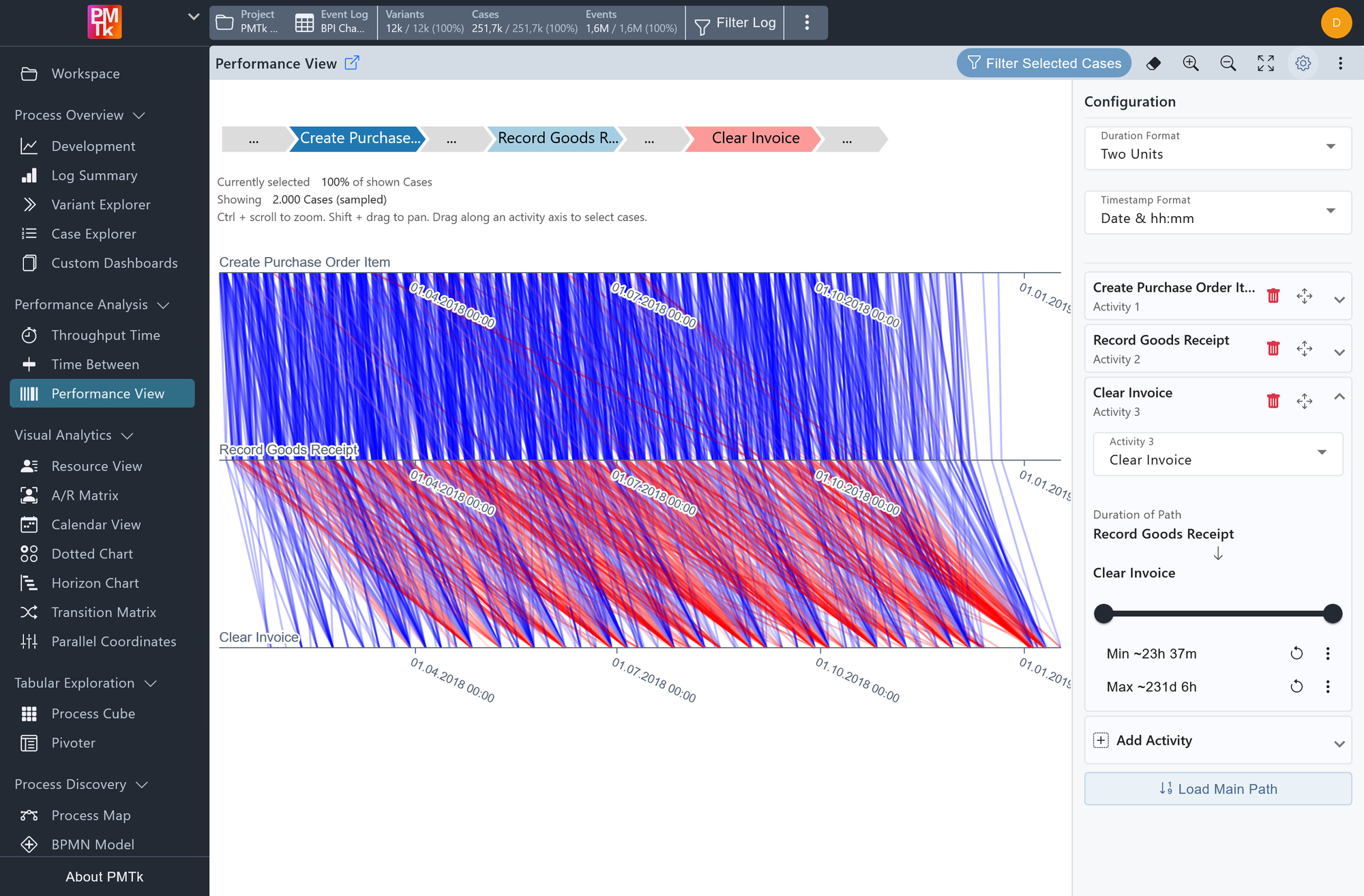
Screenshot shows the Performance View configured with three activities (Create Purchase Order Item, Record Goods Receipt, and Clear Invoice). Each line represents one sampled case, connecting the execution timestamps of the three activities. Lines are colored from blue to red based on relative waiting time, with the configuration panel open on the right showing a duration filter applied between Record Goods Receipt and Clear Invoice.
The Performance View visualizes the execution timing of selected activities across a sample of up to 2,000 cases, making it possible to analyze waiting times between process steps and identify performance patterns at a glance. Each case is represented as a line connecting the selected activities along their respective time axes (i.e., the horizontal position of each point on an activity's axis reflects when that activity was executed for that case). The slope and length of the line segment between two activities therefore directly encodes how long a case waited between them.
Lines are color-coded on a blue-to-red scale to reflect relative waiting time between consecutive activities: blue lines indicate shorter waits compared to other cases, while red lines indicate longer ones. This makes it immediately apparent where delays are concentrated and how they are distributed across the process timeline. Activities also do not need to directly follow one another. As seen in the path illustration at the top, intermediate steps may exist between them.
The line below the path illustration reports how many cases are currently selected and how many of the sampled cases are being shown (e.g., "Showing 2,000 Cases (sampled)"). Scroll while holding Ctrl over the chart to zoom, or use the and buttons in the toolbar. Hold Shift and drag to pan the zoomed view.
Performance View Toolbar
The following controls are accessible via the icon buttons in the toolbar:
| Control | Description |
|---|---|
| Filter Selected Cases | See Filter below. |
| Clear Axis Highlights | Clears all active axis range highlights at once. |
| Zoom In | Zooms the chart in, same as scrolling up while holding Ctrl. |
| Zoom Out | Zooms the chart out, same as scrolling down while holding Ctrl. |
| Reset Zoom | Resets the chart zoom to the initial view. |
| Configuration | Toggles the configuration panel. See below for details on available settings. |
Performance View Configuration
The configuration panel provides the following options.
| Control | Description |
|---|---|
| Duration Format | Controls the unit(s) used to display waiting times, both in the Duration of Path filter and the case highlighting annotation. Options: All Units, Two Units(default), Single Unit (e.g., Days, Hours, Minutes). |
| Timestamp Format | Controls the display format of activity execution timestamps in the case highlighting annotation. Options: Date, Date & hh:mm(default), Date & hh:mm:ss. |
| Add Activity | Click on Add Activity to expand the form and add a new activity to the sequence. |
| Order Activities | Each activity is labeled by its position (Activity 1, Activity 2, Activity 3, ...) and can be reordered using the drag handles , or removed using the trash icon . |
| Duration of Path | Expanding an activity (other than the first) reveals a range slider that filters cases based on the waiting time recorded between that activity and the one preceding it. The minimum and maximum bounds can be adjusted individually using the range slider or by entering values directly, and each bound can be reset via . |
| Load Main Path | Clicking Load Main Path automatically populates the activity list with the most frequently occurring sequence of activities across all cases in the event log, providing a sensible starting point without requiring manual configuration. |
Performance View Highlighting
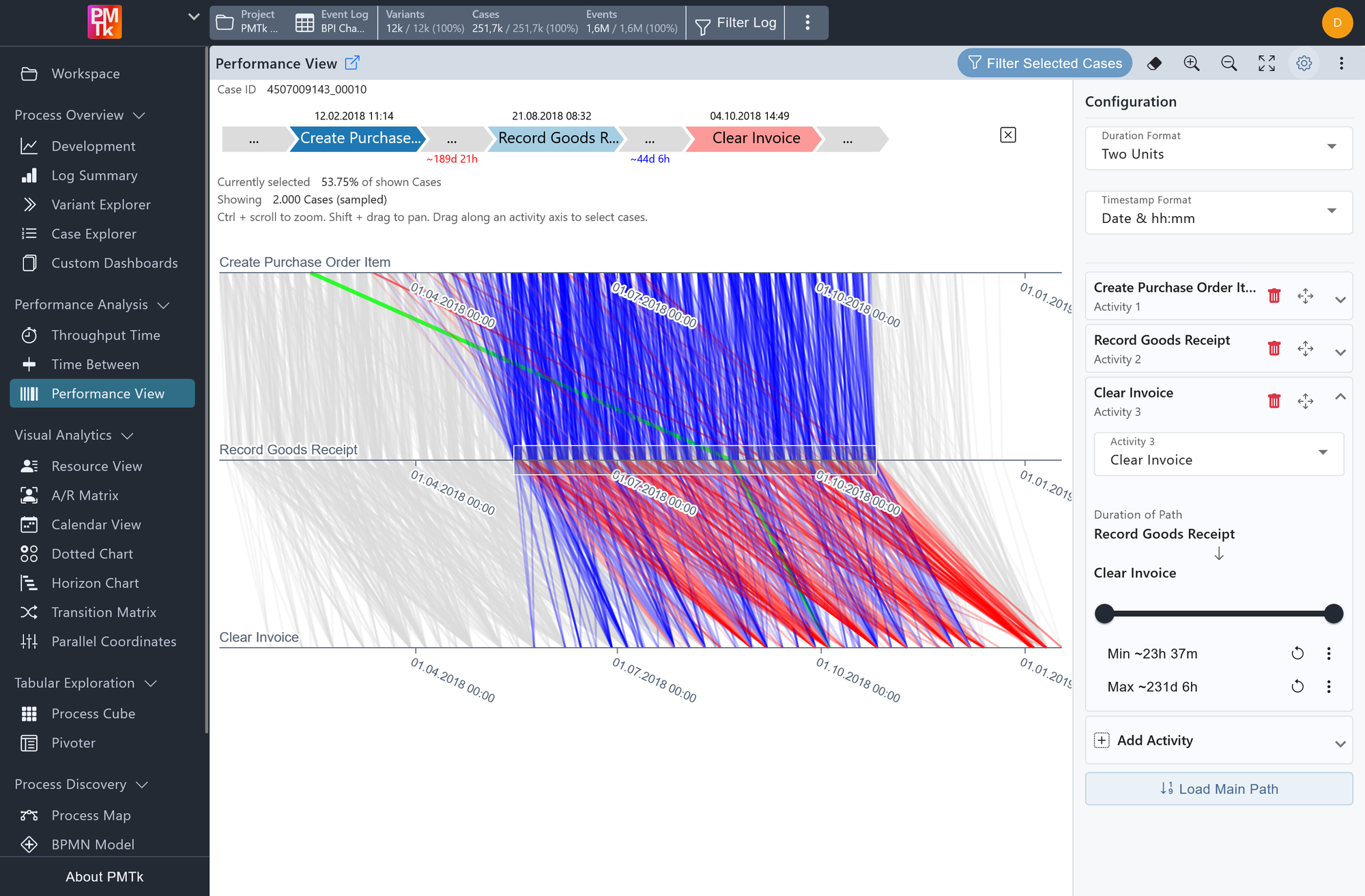
Screenshot shows the Performance View with a single case highlighted in green. The path annotation at the top displays the execution timestamps of each activity and the waiting times between them. All other cases are visible in the background, with a portion greyed out due to an active axis range selection.
Case Highlighting
Clicking on any individual line in the chart highlights that specific case. When a line is selected, the path annotation at the top of the chart updates to display:
- The Case ID of the selected case.
- The timestamps at which each configured activity was executed.
- The waiting times between consecutive activities.
Axis Highlighting
Clicking and dragging on any activity's time axis marks a range on that axis. All lines that do not pass through the marked range are greyed out, allowing you to focus on cases that executed that activity within a specific time window. Multiple axes can be marked simultaneously. Click in the toolbar to clear all active axis highlights at once.
Performance View Filtering
Clicking Filter Selected Cases in the toolbar applies the current view as a Performance Spectrum Filter, restricting the event log to only cases that match the configured activity sequence. If one or more axis ranges are highlighted, the filter additionally constrains cases to those that fall within the marked ranges on each highlighted axis. This allows for precise, performance-aware filtering (for example, retaining only cases where a specific activity was executed within a particular time window).
