Visual Analytics Calendar View
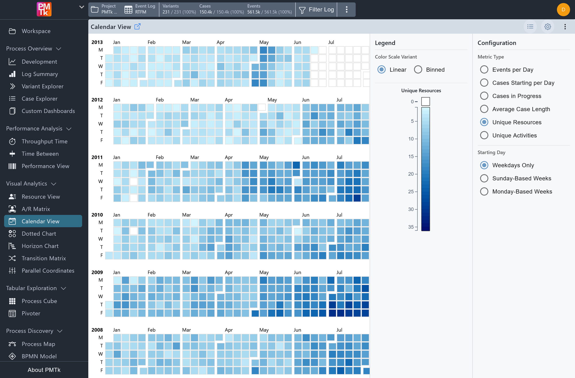
Screenshot shows the calendar view visualizing the daily number of unique resources being active in the process. The darker the cell color, the more unique resources are being active in the process.
The Calendar View provides a heatmap-style overview of process activity across the entire recorded timeframe of an event log. Each cell represents a single day, colored by intensity to reflect the magnitude of the selected metric (darker cells indicate higher values, lighter cells indicate lower ones). The view is organized by year and month along the horizontal axis, and by day of the week along the vertical axis, making it easy to spot recurring weekly patterns, seasonal trends, or anomalies at a glance.
Calendar View Configuration
The legend panel and configuration panel provide the following settings.
| Setting | Description | Values |
|---|---|---|
| Color Scale Variant | Controls how metric values are mapped to colors. |
|
| Metric Type | Determines the metric visualized in the calendar cells. |
|
| Starting Day | Determines how weeks are laid out on the vertical axis. |
|
Calendar View Filtering
The Calendar View supports timeframe filtering through direct interaction with the calendar cells. To define a time range:
- Click on a start day to anchor the beginning of the range.
- Click on an end day to complete the selection.
This applies a Timeframe Filter to the event log, restricting all downstream analyses and views to the selected date range. The filter is consistent with timeframe filters applied elsewhere in the tool and can be cleared or adjusted at any time through the filter controls in the top bar.
