Process Overview Development
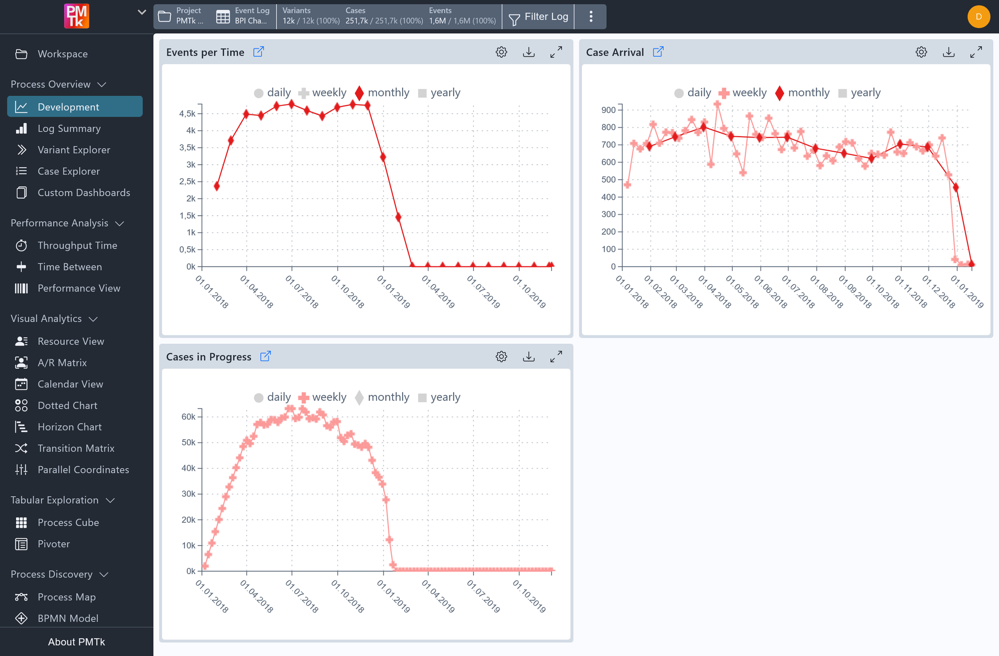
Screenshot shows the Development dashboard, displaying three time-based charts: Events Per Time, Case Arrival, and Cases In Progress. The Case Arrival chart has both weekly and monthly granularities active simultaneously, illustrating how multiple time modes can be overlaid in the same chart.
The Development dashboard provides a time-based overview of process activity across the recorded event log through three complementary line charts: Events Per Time, Case Arrival, and Cases In Progress. Together, they give a high-level picture of how process load has evolved over the recorded timeframe, how busy the process was at any point, how many new cases were entering it, and how many were actively running simultaneously.
Each data point marker is rendered at the end of the time interval it represents.
Development Charts
Events Per Time
Displays the number of events recorded within each time interval. This reflects the overall activity level of the process and can reveal busy periods, quiet phases, or abrupt drops in process execution.
Case Arrival
Displays the number of new cases that started within each time interval. This chart highlights intake patterns like seasonal peaks, growth trends, or sudden changes in how many cases enter the process.
Cases In Progress
Displays the number of cases that were actively running at any point within each time interval. This reflects the overall workload carried by the process at any given time, and is particularly useful for identifying periods of congestion or backlog buildup.
Time Granularity
Each chart independently supports multiple time granularities, which can be toggled on or off at the top of each chart. Multiple granularities can be active simultaneously in the same chart, rendering each as a separate line. Available options are: Secondly, Minutely, Hourly, Daily, Weekly, Monthly, and Yearly.
Granularities that would not produce meaningful results for the loaded event log are hidden automatically, for example, a Yearly option is not shown if the log covers only a single year. Additionally, if the log spans at least two years, the finer granularities (Secondly, Minutely, Hourly) are hidden to avoid performance issues with very large datasets.
Development Toolbar
Each chart has its own set of controls accessible via the icon buttons in its top-right corner:
| Control | Description |
|---|---|
| Configuration | Includes the Group by Case Attributes settings, which allows to group cases by the selected case attributes, splitting the single curve into multiple color-coded ones. A legend appears alongside the chart to match each color to a group. |
| Legend | Toggle the legend that appears when a Group by Case Attributes setting is active. |
| Expand View | Expands the chart to fill the screen for a closer look. |
| Download | Exports the chart as an image or downloads the underlying plot data. |
