Visual Analytics Horizon Chart
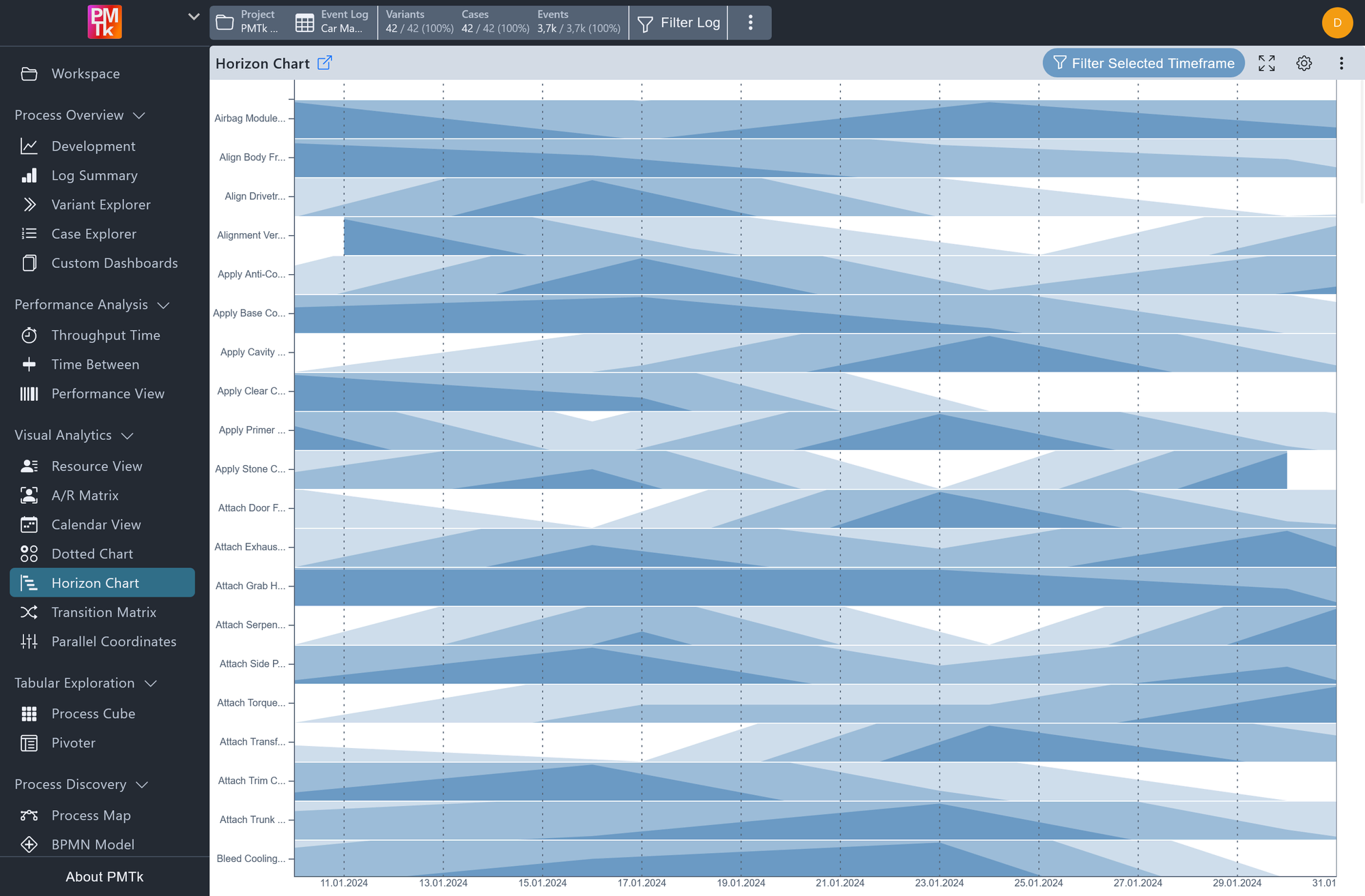
Horizon Chart showing weekly activity occurrences in a car manufacturing event log. Each row represents one activity, darker bands indicate higher occurrence counts. Relative values are used, so each row is independently normalized to its own peak frequency.
The Horizon Chart shows how frequently each value of a selected event attribute appears over time. Each row corresponds to one attribute value (e.g., a specific activity), with the horizontal axis divided into intervals by the selected time unit.
Occurrences within each row are visualized as a layered area chart split into three color bands of increasing intensity (light, medium, and dark blue), each representing a higher magnitude tier. This keeps high-volume and low-volume rows at the same height, making it easy to compare trends across many categories at once.
By default, values are shown relative to each row's own peak, so the highest recorded count always reaches full height. This allows you to compare trend shapes across rows regardless of their absolute volumes.
Horizon Chart Configuration
The configuration panel provides the following options.
| Setting | Description | Values |
|---|---|---|
| Time Unit | Sets the temporal granularity of the horizontal axis. |
|
| Attribute Y | Selects the event-level attribute whose distinct values are rendered as individual rows. |
|
| Show Absolute Values | Controls the values displayed in the tooltip when hovering over the chart. When disabled, the tooltip shows the occurrence count as a percentage relative to that row's own peak. When enabled, the tooltip shows the raw absolute count instead. |
|
Horizon Chart Interaction & Filtering
The Horizon Chart supports the following interactions for navigating and filtering your data.
| Interaction | Description |
|---|---|
| Zoom | Click and drag anywhere on the chart to draw a selection rectangle over a time range of interest. Releasing the mouse zooms the chart into the selected area, updating the horizontal axis to reflect the new range. |
| Reset Zoom | The zoom can be reset in two ways:
|
| Apply Timeframe Filter | While zoomed in, clicking Filter Selected Timeframe in the toolbar creates a Timeframe Filter that restricts the event log to only the events that occurred within the currently visible time range. This filter propagates globally to all other components in the tool. |
