Process Discovery Process Map
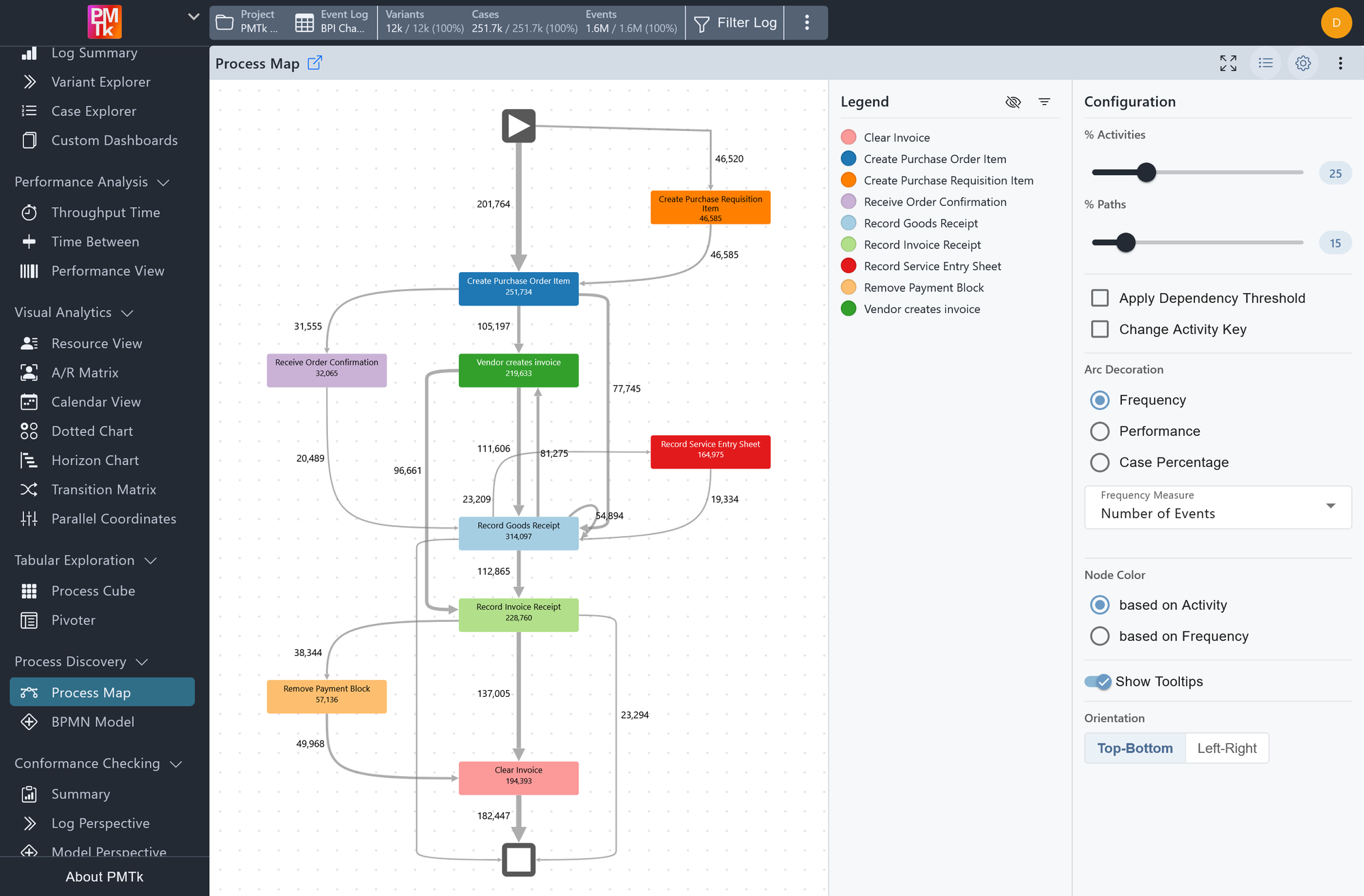
Screenshot shows the Process Map, which displays the most frequent activities and directly-follows transitions as a directed graph. Nodes are color-coded by activity type and annotated with event counts. Edges are decorated with frequency values.
The Process Map displays the event log as a Directly-Follows Graph (i.e., a directed graph in which each node represents an activity and each arrow (edge) represents a directly-follows relation between two activities). The thickness or annotation of each edge reflects the selected arc decoration metric, making it easy to identify the most frequent or most time-consuming transitions at a glance. A start node ▶ and end node ■ mark the entry and exit points of the process.
The graph does not necessarily show all activities and paths in the log. Instead it focuses on the most frequent ones, controlled by the % Activities and % Paths sliders in the configuration panel.
Process Map Legend
The Legend panel, toggled via in the toolbar, lists every activity and its assigned color. Clicking an activity name in the legend toggles its color, dimming that activity throughout the graph to help it stand out (or fade) visually. Click to dim all colors, or to change how the entries are sorted.
Process Map Configuration
The configuration panel provides the following options.
| Setting | Description | Values |
|---|---|---|
| % Activities | Sets the percentage of the most frequent activities to include in the graph. Reducing this value simplifies the map by removing less common activities. |
|
| % Paths | Sets the percentage of the most frequent directly-follows relations to include. Reducing this value removes less common transitions from the graph. |
|
| Apply Dependency Threshold | When enabled, a slider appears allowing you to set a dependency threshold between -1 and +1. The dependency value between two activities reflects the degree of belief in their causal relationship. Higher values enforce stricter causality requirements, filtering out edges that are less likely to represent true process dependencies. |
|
| Change Activity Key | When enabled, a dropdown appears allowing you to replace the default Activity attribute with any other attribute as the basis for the graph nodes. |
|
| Arc Decoration | Controls what the edges of the graph communicate. |
|
| Frequency Measure | Controls how the frequency values are calculated for each edge. Requires Arc Decoration: Frequency |
|
| Performance Metric | Controls how the performance values are calculated for each edge. Requires Arc Decoration: Performance |
|
| Time Format | Controls the unit(s) used to display transition durations. Requires Arc Decoration: Performance |
|
| Node Color | Controls how activity nodes are colored. |
|
| Show Tooltips | When enabled, hovering over nodes and edges displays additional information in a tooltip. |
|
| Time Range | A range slider allowing you to restrict the graph to a specific portion of the recorded timeframe. |
|
| Orientation | Controls the layout direction of the graph. |
|
Process Map Node Interactions
Clicking on any activity node in the graph opens a context menu with the following options:
| Option | Effect |
|---|---|
| Open Activity Dashboard | Opens a detailed statistics panel for that activity (see below). |
| Filter cases containing | Retains only cases that include at least one occurrence of this activity. |
| Filter cases not containing | Removes all cases that include this activity. |
| Filter cases with rework | Retains only cases where this activity occurs more than once. |
| Filter cases starting with | Retains only cases whose first activity is this one. |
| Filter cases ending with | Retains only cases whose last activity is this one. |
| Crop log from activity | Crops all cases to begin at this activity. |
| Crop log to activity | Crops all cases to end at this activity. |
Process Map Edge Interactions
Clicking on any edge in the graph opens a context menu with the following options:
| Option | Effect |
|---|---|
| Open Edge Dashboard | Opens a detailed performance panel for that transition (see below). |
| Filter cases containing | Retains only cases containing this directly-follows transition. |
| Filter cases not containing | Removes all cases containing this directly-follows transition. |
| Filter subcases between | Crops all cases to the subcase between the two connected activities. |
Activity Dashboard
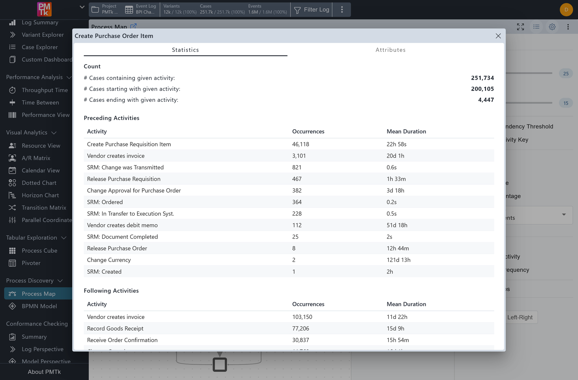
Screenshot shows the Activity Dashboard for the Create Purchase Order Item activity. The Statistics tab displays case counts and a table of preceding activities with their occurrence counts and average transition durations.
Clicking Open Activity Dashboard from a node's context menu opens a panel providing detailed statistics for that activity, organized into two tabs:
Statistics Tab
Displays various case-level counts for the selected activity, as well as a list of preceding activities in a table, showing for each predecessor its number of occurrences and the average duration of the transition from that predecessor to the selected activity.
Attributes Tab
Allows you to select any event-level attribute (e.g. Resource) and view a breakdown of how frequently each value of that attribute appears in events belonging to this activity.
Edge Dashboard
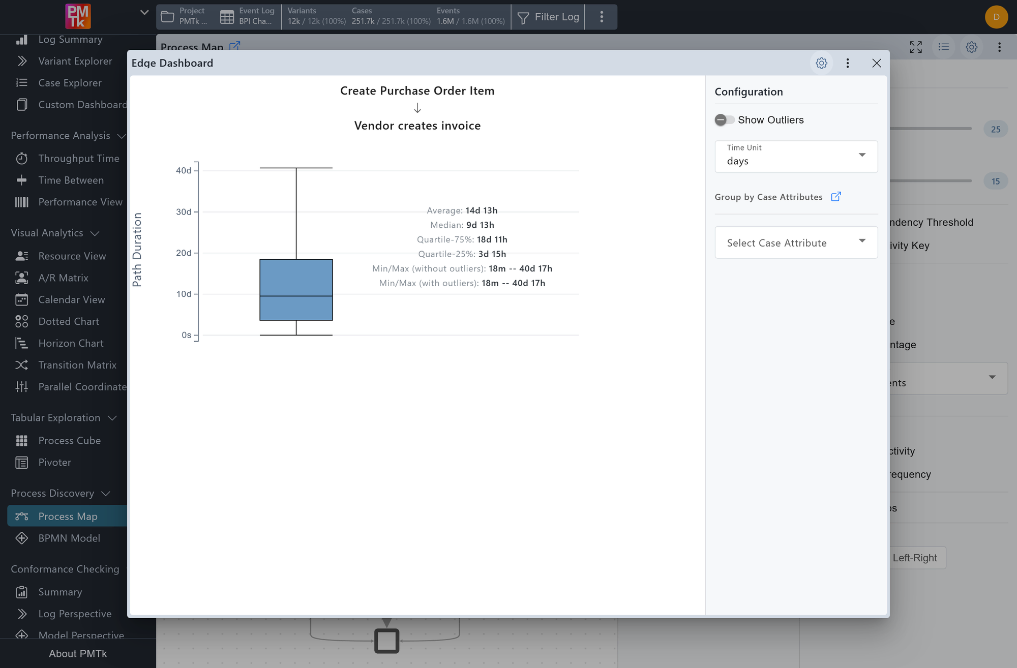
Screenshot shows the Edge Dashboard for the transition from Create Purchase Order Item to Vendor creates invoice. A box plot summarizes the path duration distribution in days, with configuration options for outlier display, time unit, and grouping by case attribute.
Clicking Open Edge Dashboard from an edge's context menu opens a panel displaying a box plot of the path duration for that specific directly-follows transition, showing the average, median, interquartile range, and min/max values with and without outliers. The following configuration options are available:
| Setting | Description | Values |
|---|---|---|
| Show Outliers | Controls whether outlier data points are included in the box plot. |
|
| Time Unit | Sets the time unit used in the box plot. |
|
| Group by Case Attributes | Splits the analysis into multiple colored box plots, one per selected attribute value. |
|
