Data Exploration Process Cube
Screenshot shows the Process Cube view with Case Throughput Time as the X Column (divided into four ranges) and Month & Year of Case Start as the Y Column, with the Configuration panel open on the right. Each cell shows the aggregated count of cases at the intersection of a throughput-time range and a calendar month. The Summary (sum) row and column provide marginal totals; since Color Inner Cells Only is enabled, only the individual cells are colored.
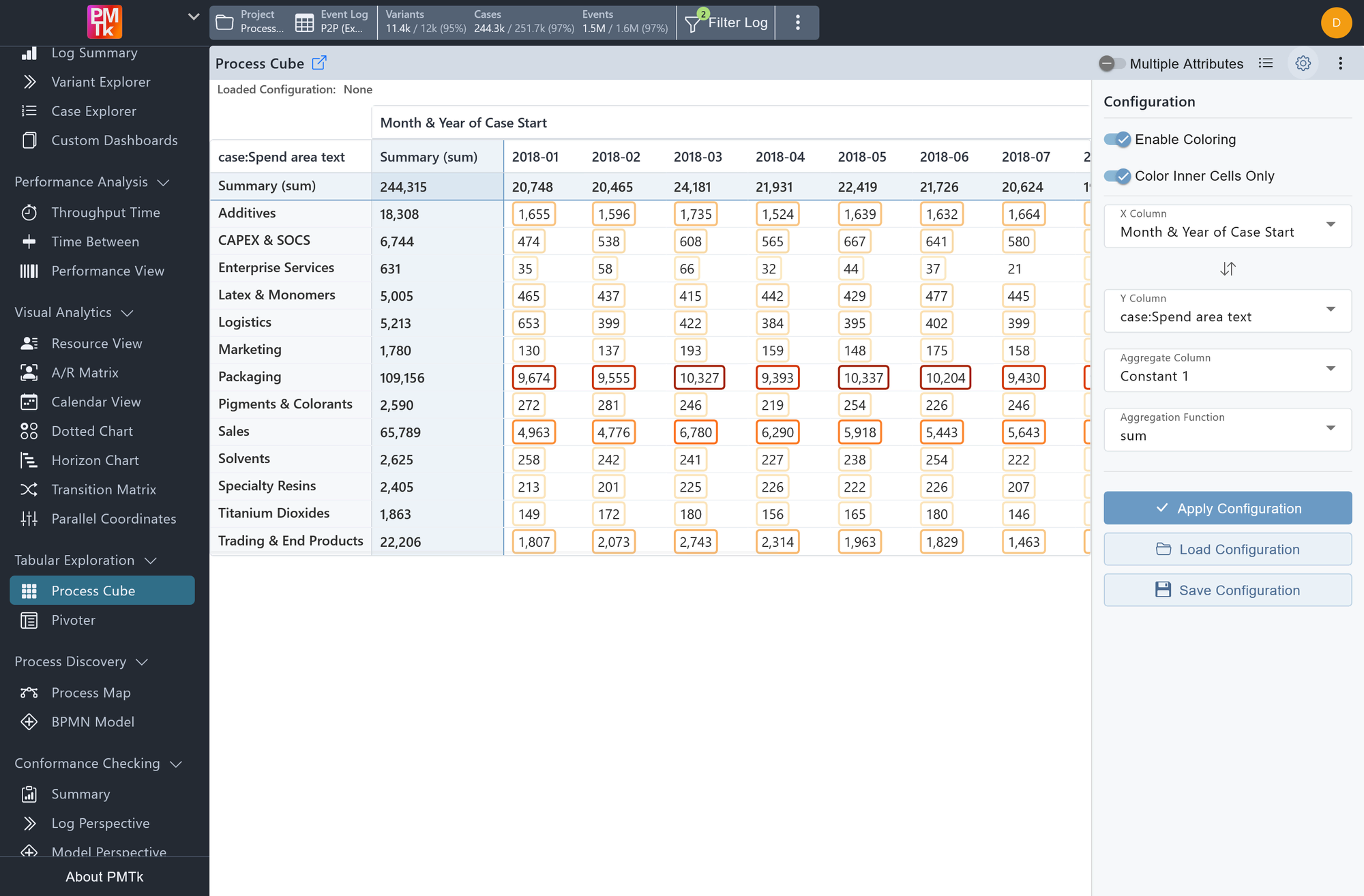
The Process Cube organises the loaded event log along one or more X attributes and one or more Y attributes and aggregates a chosen metric for each combination of their values. The result is a cross-tabulation grid where every cell represents a specific slice of your data, making it easy to spot how performance metrics vary across different combinations of case or event attributes. In the rendered table, the X selection is shown horizontally as data columns, and the Y selection is shown vertically as row labels.
Columns and Dimensions
Select an X Column attribute and a Y Column attribute in the configuration panel. Enabling Multiple Attributes in the toolbar (disabled by default) allows selecting more than one attribute per axis instead. How the values of each attribute become the rows or columns of the grid depends on the feature type:
| Feature type | How values appear in the grid |
|---|---|
| Text (String) | Each distinct feature value becomes its own row or column header (e.g., one column per calendar month when using Month & Year of Case Start). |
| Numeric, including duration features | The feature's value range is divided into contiguous intervals. Each interval becomes one row or column header (e.g., [0 second, 3.0 months], [3.0 months, 6.1 months], …). The number of intervals is controlled by the Automatic Divisions field, or set manually via Set Custom Divisions (see Custom Divisions below). |
When several attributes are selected for the same axis, PMTk combines their values or intervals into composite labels. Numeric attributes in such a multi-attribute axis can still be configured individually through the Set Custom Divisions buttons in the configuration panel.
Cell Values and Aggregation
Each cell is populated with all cases whose attribute values fall into the corresponding X/Y combination. The value displayed in the cell is the result of aggregating the selected numeric Aggregate Column across those cases using the chosen Aggregation Function.
For example, selecting Constant 1 with function sum produces a simple case count per cell. Selecting a numeric attribute such as Case Throughput Time with function mean shows the average throughput time for cases in that cell.
| Aggregation Function | Description |
|---|---|
| sum | Total of all values in the cell. |
| mean | Average value across all cases in the cell. |
| median | Median value across all cases in the cell. |
| min | Smallest value found in the cell. |
| max | Largest value found in the cell. |
Case-level vs. event-level attributes
The Process Cube is computed from PM4Py's feature table, which contains one row per case. This means categorical event-level attributes are encoded as per-case presence features, while numeric features contribute one value per case to the aggregation (currently it is the value of the case's last event, this will change in a future release).
- Case-level attributes carry a single distinct value per case.
- As an X/Y Column: the attribute assigns the case to one value or interval on that axis.
- As an Aggregate Column: one feature-table value contributes per case.
- Categorical event-level attributes may hold different values across a case's events.
- As an X/Y Column: a case can appear in multiple axis values, once per distinct value it contains, but never more than once in the same cell for repeated executions of the same value.
- As an Aggregate Column: the dropdown only offers numeric feature-table columns. Numeric event-level columns are reduced to one feature value per case before the Process Cube aggregates them (currently by only considering the value of the case's last event, this will change in a future release).
Summary Row and Column
The Summary row and column aggregate across the displayed cell values in their respective dimension. The aggregation function used for these super-aggregations is the same one selected in the configuration. With sum, these summary cells behave as marginal totals over the displayed cells. If a categorical event-level dimension lets the same case appear in multiple cells, those summaries can therefore exceed the number of unique cases.
When using mean, note that the summary shows the mean of cell means, not the mean over all raw cases.
Cell Drill-Down
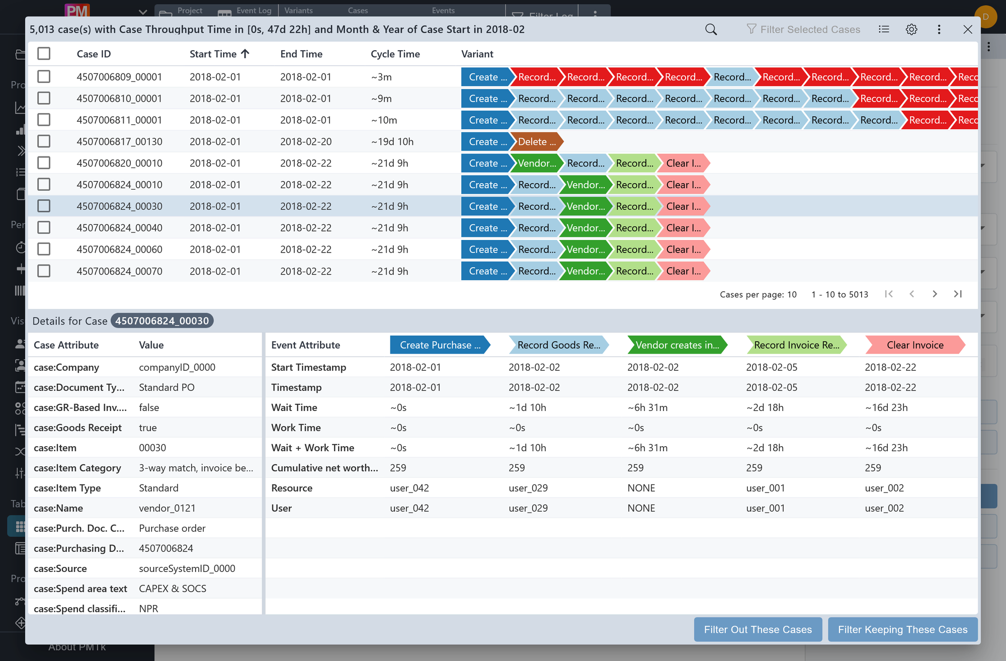
Screenshot shows the cell drill-down dialog for a specific X/Y combination (Case Throughput Time in [0s, 47d 22h] / Month & Year of Case Start in 2018-02). The dialog embeds the Case Explorer, scoped to the 5,013 cases that fall into this cell, with a case selected in the Details for Case panel below. Two filter actions are available at the bottom of the dialog.
Clicking any cell with a value opens a dialog containing the Case Explorer, scoped to only the cases assigned to that cell. See the Case Explorer page for a detailed explanation of its table and Details for Case panel. Two filter actions are available at the bottom of the dialog:
| Action | Description |
|---|---|
| Filter Keeping These Cases | Adds a Text Attributes Filter that retains only the cases in this cell. |
| Filter Out These Cases | Adds a Text Attributes Filter that excludes the cases in this cell. |
Custom Divisions
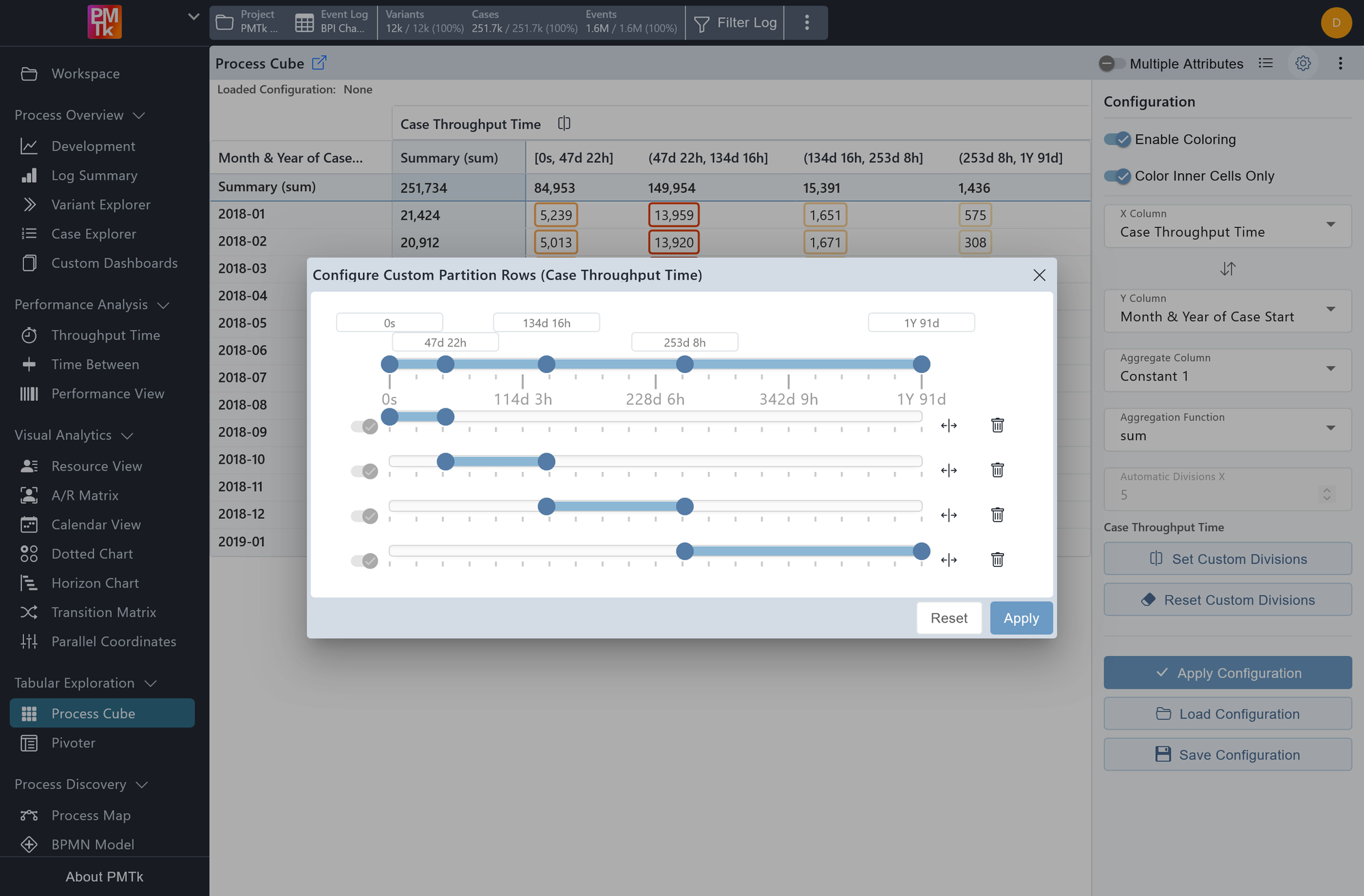
Screenshot shows the Configure Custom Partition Rows dialog for a numeric X Column. Five ranges are defined across the full value span and can each be resized, split, or deleted individually.
For numeric columns, the number of divisions is set automatically via the Automatic Divisions X / Y field in the configuration panel. To define the boundaries manually, click Set Custom Divisions beneath the respective column name. This opens a range editor where the full value span is divided into contiguous ranges. The following actions are available per range:
| Action | Description |
|---|---|
| Adjust boundaries | Enter values directly in the boundary fields above the slider, or drag the handles on the slider itself to move the boundaries. |
| Split | Splits the range into two equal halves. Both resulting ranges can then be adjusted independently. |
| Delete | Removes the range. The neighboring ranges automatically expand to fill the vacated space, keeping the full value span covered. |
Click Apply to confirm, Reset to restore defaults, or Close to discard changes.
Process Cube Toolbar
The following controls are available in the toolbar:
| Control | Description |
|---|---|
| Multiple Attributes | Disabled by default, restricting each of the X and Y axes to a single attribute. When enabled, multiple attributes can be selected for the same axis (see Columns and Dimensions above). |
| Legend | Toggles the Legend panel, which shows the color scale and its two variants: Linear (continuous gradient) and Binned (stepped gradient). |
| Configuration | Toggles the Configuration panel where you set the X and Y Columns, Aggregate Column, Aggregation Function, and Automatic Divisions. Use Apply Configuration to recompute the cube. Use Load Configuration to open the saved configurations available in the current project, with global configurations listed before your private ones. Use Save Configuration to save the current setup: give it a name and choose Private (visible only to you) or Global (visible to all users; requires edit permissions). Configurations are stored as project-scoped Process Cube settings and can be overwritten or deleted from this menu when you have the required permissions. Two coloring toggles are also found here: |
| Setting | Description |
|---|---|
| Enable Coloring | Toggles the cell coloring. When enabled, each cell's border is colored on a scale from white for zero values through orange and red hues for higher values, reflecting the magnitude of its aggregated value relative to the other cells. The color scale and its range are shown in the Legend panel. |
| Color Inner Cells Only | When enabled, the Summary row and column are excluded from the coloring. Since summary values naturally trend toward the extremes, including them tends to skew the color scale and dilute the coloring of the individual cells that are usually of more interest. |
Opens a menu with options to download the underlying plot data as .csv or .xlsx.
