Visual Analytics Resource View
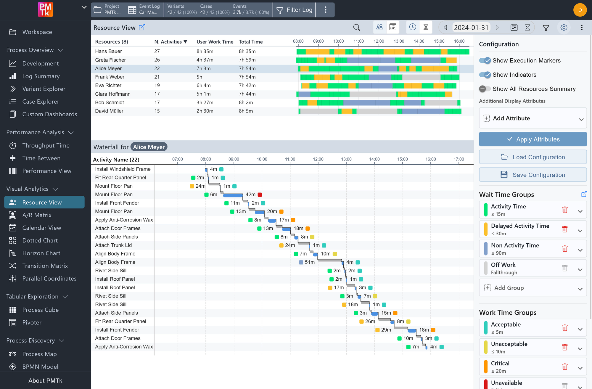
Screenshot shows the Resource View for a car manufacturing event log. The upper Timeline Chart displays the SLA Group distribution for all resources across the selected timeframe. The lower Waterfall Chart details the individual activity sequence of the selected resource Alice Meyer, showing Resource Wait Times and Work Times for each executed activity.
The Resource View provides a detailed, time-based analysis of individual resource behavior within the process. It combines two complementary visualizations (a Timeline Chart and a Waterfall Chart) to give both a high-level overview of all resources and a granular breakdown of a single resource's activity sequence.
The view is built around SLA Groups, which categorize Wait and Work times into user-defined tiers (e.g. Activity Time, Delayed Activity, Non-Activity Time). This allows teams to quickly assess whether resources are operating within acceptable bounds or falling into undesirable time categories. A detailed explanation of how to configure SLA Groups can be found on the SLA Editor page.
Note that the Wait Time used throughout this view is resource-based (also referred to as Resource Wait Time): it measures the time between when a resource finishes one activity and begins the next, rather than being tied to case-level waiting.
Defaults and visibility options for this component (initial time mode, execution markers, indicators, SLA group editing, and more) can be configured in Feature Management.
Timeline Chart
The Timeline Chart occupies the upper portion of the view and provides a side-by-side comparison of all resources within the selected timeframe. Each row corresponds to a resource and consists of three columns:
| Column | Description |
|---|---|
| Resources | The name of the resource. |
| N. Activities | The total number of activities executed by that resource within the selected timeframe. |
| User Work Time | The cumulative time the resource spent in SLA Groups that are configured as active (as defined in the SLA Editor). |
| Total Time | The total cumulative time spent by the resource within the selected timeframe, without any SLA Group restrictions. |
To the right of these columns, a horizontal bar spans the selected timeframe for each resource, filled with color-coded segments representing the SLA Groups their time falls into. Thin vertical black lines within the bar mark Execution Markers, i.e., the precise moments at which individual activities were completed. These can be toggled on or off in the configuration panel.
Clicking on a row selects that resource (or, in Resource Over Time mode, that period) and loads the corresponding activity sequence into the Waterfall Chart below.
View Modes
Two independent toggle controls in the toolbar, located between the search field and the timeframe selection, determine how the Timeline Chart is laid out:
| Toggle | Description |
|---|---|
| / | Sets what each row of the Timeline Chart (its Y-Axis) represents:
|
| / | Sets what the horizontal axis of the Timeline Chart (its X-Axis) represents:
|
Both toggles can be set independently of each other, e.g. selecting Total Durations together with Resource Over Time.
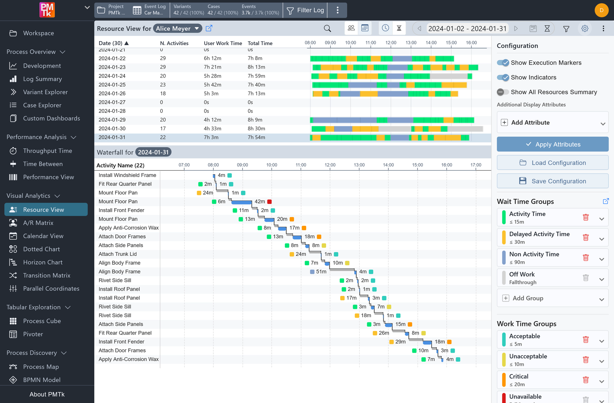
Screenshot shows the Resource View in Resource Over Time mode for the resource Alice Meyer, with Time Mode set to Daily. Each row of the Timeline Chart therefore represents one day, and the Waterfall Chart below shows the activity sequence for the selected day, 2024-01-31.
In Resource Over Time mode, the view title changes to Resource View for Alice Meyer, with the resource name shown as a chip. Click the chip to select a different resource.
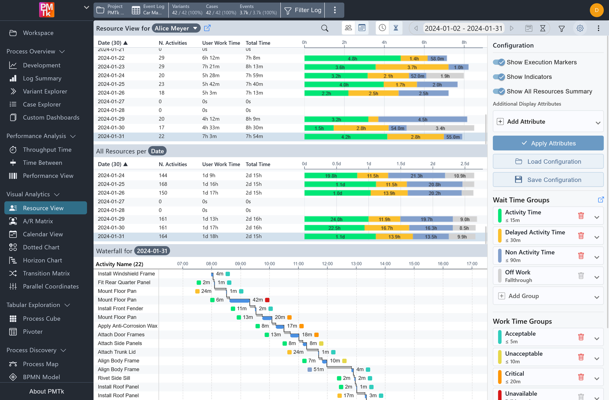
Screenshot shows the same Resource Over Time view with Total Durations and Show All Resources Summary also enabled. The Timeline Chart's horizontal axis now measures accumulated duration rather than time of day. An additional All Resources per Date section appears between the Timeline Chart and the Waterfall Chart, aggregating the same columns and chart across every resource for each day.
Waterfall Chart
The Waterfall Chart occupies the lower portion of the view and provides a granular, activity-level breakdown for a single selected resource and, by default, the entire selected timeframe. The current selection is indicated by a highlighted label above the chart (e.g. Waterfall for Alice Meyer). In Resource Over Time mode, this label instead shows the selected timeframe (e.g. Waterfall for 2024-01-31), since each row of the Timeline Chart represents one timeframe for a selected resource.
Each row in the chart represents one executed activity and is laid out along a shared horizontal time axis. For each activity, the chart displays:
| Attribute | Description |
|---|---|
| Resource Wait Time | Shown as a grey bar (with a label to the left of the activity's start), it represents the idle time between the previous activity and this one. An SLA Group indicator is shown at the left edge of the label. |
| Work Time | Shown as a blue bar (with a label to the right of the activity's end), representing the time the resource actively spent executing the activity. An SLA Group indicator is shown at the right edge of the label. |
The waterfall layout reflects the natural chronological flow of a resource's workday, making it straightforward to identify where time is being lost to waiting or where activities are running longer than expected.
The chart displays up to 500 activities within the selected timeframe.
Resource View Toolbar
The toolbar is located above the Timeline Chart and provides quick access to view controls via icon buttons. Besides the standard controls found in all dashboards (like configuration toggle or chart download), the exclusive ones from left to right are:
| Control | Description |
|---|---|
| Search | Search for a specific resource by name to locate them in the Timeline Chart. |
| / Y-Axis Mode | Toggles the Timeline Chart between Compare Resources and Resource Over Time. See View Modes above. |
| / X-Axis Mode | Toggles the Timeline Chart between Chronological and Total Durations. See View Modes above. |
| Timeframe | Set the displayed time range. Also allows selecting the time mode (Daily, Weekly, Monthly, Yearly, or Total) to control the granularity of the timeline. |
| Local Filter | Apply a filter that is scoped exclusively to this view and does not propagate globally to other components. |
Resource View Configuration
The configuration panel provides the following options.
| Setting | Description | Values |
|---|---|---|
| Show Execution Markers | When enabled, thin vertical lines marking the completion of individual activities are overlaid on the Timeline Chart bars. |
|
| Show Indicators | When enabled, SLA Group indicator icons are displayed near the Wait Time and Work Time labels in the Waterfall Chart. |
|
| Show All Resources Summary | When enabled in Resource Over Time mode, adds an All Resources per Date section between the Timeline Chart and the Waterfall Chart. It mirrors the Timeline Chart's columns and layout, but aggregates the workload (and SLA group shares) of every resource for each period, giving an at-a-glance overview of the total workload alongside the selected resource's own data. |
|
| Additional Display Attributes | Allows adding supplementary case- or event-level attributes (e.g. Case ID) as extra columns in the Waterfall Chart. After adding the desired attributes, click Apply Attributes to update the view. |
|
| SLA Groups | Define and manage the SLA Groups used to categorize Resource Wait Times and Work Times respectively. Each group has a configurable name, color, and time threshold (in minutes). A detailed explanation of SLA Group configuration can be found on the SLA Editor page. |
|
The current configuration (including additional display attributes, view toggles, local filters, global filters, and the selected timeframe) can be saved and reloaded using the Save Configuration and Load Configuration buttons. Configurations are stored as project-scoped Resource View settings and can be overwritten or deleted from this menu when you have the required permissions.
When saving, give the configuration a name and choose Private (visible only to you) or Global (visible to all users; requires edit permissions). You can also choose whether to include the selected timeframe, excluding it is recommended when the underlying data is updated regularly, as a saved timeframe may no longer be meaningful after new data has been loaded.
When loading, you will see a list of saved configurations available in the current project, with global configurations listed before your private ones. You also have the option to exclude global filters from being applied, which is useful if you have already set up global filters you want to preserve.
Note that SLA Group configurations are not included in saved configurations, as they are managed separately through the SLA Settings.
