Performance Analysis Throughput Time
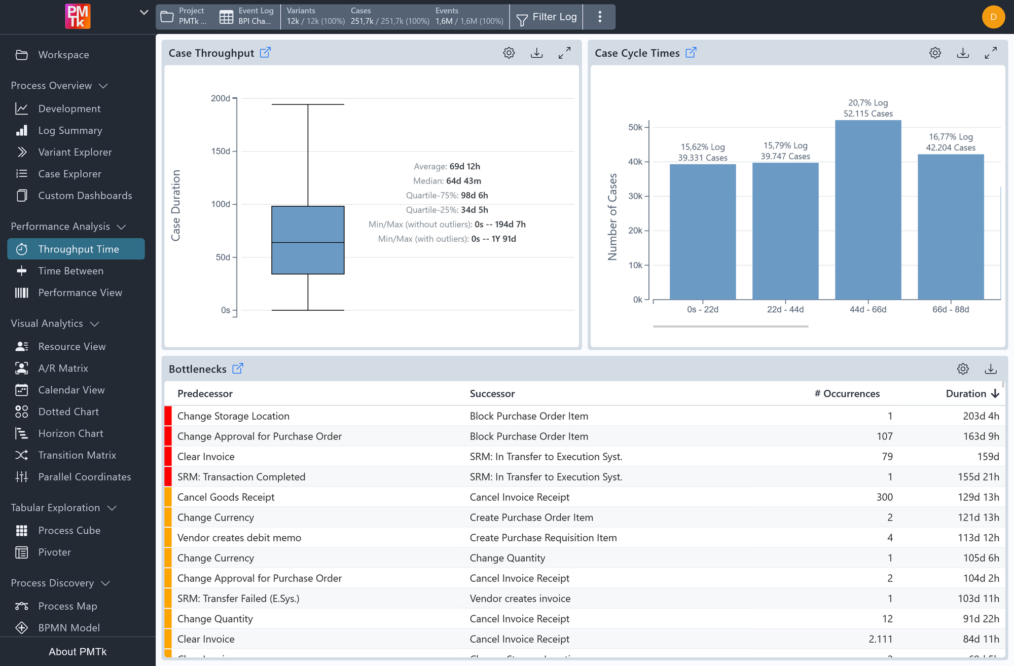
Screenshot shows the Throughput Time dashboard for an event log. The Case Throughput box plot summarizes case duration statistics. The Case Cycle Times histogram shows the distribution of case durations across four bins measured in days. The Bottlenecks table lists directly-follows activity relations ranked by their average duration, with a colored severity indicator on the left edge of each row.
The Throughput Time dashboard provides a focused analysis of how long cases take to complete and where time is being lost between process steps. It consists of three complementary charts: Case Throughput, Case Cycle Times, and Bottlenecks. Together they give both a statistical summary of case durations and a concrete, ranked view of the activity transitions that contribute most to delays.
Throughput Time Charts
Case Throughput
A box plot summarizing the distribution of case durations across the event log. The plot displays the average, median, interquartile range (Q25-Q75), and min/max values both with and without outliers. This gives a concise statistical picture of how long cases typically run and how much variation exists.
Case Cycle Times
A histogram grouping cases into bins based on their total duration. Each bar shows the number of cases falling within a given duration range and its share of the total log. This complements the box plot by making the shape of the duration distribution immediately visible.
Bottlenecks
A table listing directly-follows activity relations alongside the aggregated time spent between them. Each row shows the predecessor activity, the successor activity, the number of times that transition occurred, and its aggregated duration. Rows are sorted by duration in descending order by default, placing the most time-consuming transitions at the top. A colored indicator on the left edge of each row provides a quick visual cue of relative severity. This chart is useful for identifying which specific handovers between activities are responsible for the most delay in the process.
Throughput Time Toolbar
Each chart has its own set of controls accessible via the icon buttons in its top-right corner:
| Control | Description |
|---|---|
| Configuration | Toggles the chart's configuration panel. See below for details on available settings. |
| Legend | Toggle the legend that appears when a Group by Case Attributes setting is active. |
| Expand View | Expands the chart to fill the screen for a closer look. |
| Download | Exports the chart as an image or downloads the underlying plot data. |
Throughput Time Configuration
Each chart has its own configuration panel accessible via . Case Throughput and Case Cycle Times support the Group by Case Attributes option. Additional chart-specific settings are:
| Chart | Setting | Description | Values |
|---|---|---|---|
| Case Throughput | Show Outliers | Controls whether outlier data points are included in the box plot. |
|
| Case Throughput & Case Cycle Times | Time Unit | Sets the time unit used on the vertical axis. |
|
| Case Cycle Times | Number of Bins | A slider controlling how many bins the duration range is divided into. | 1 - 30 (default: 8) |
| Bottlenecks | Performance Aggregation | Determines how the duration of each transition is aggregated across all its occurrences. |
|
Throughput Time Filtering
Case Cycle Times
Clicking on a bar in the histogram opens a filter dialog for a case-level Cycle Time Filter based on the selected bin's duration range:
| Option | Effect |
|---|---|
| Filter Cases in Bin | Retains only cases whose total duration falls within the selected bin's range. |
| Filter Cases not in Bin | Removes all cases whose total duration falls within the selected bin's range. |
Bottlenecks
Clicking on a row in the bottlenecks table opens a filter dialog supporting both positive and negative case-level filtering:
| Option | Effect |
|---|---|
| Filter Cases Containing | Retains only cases that contain the selected activity transition. |
| Filter Cases not Containing | Removes all cases that contain the selected activity transition. |
It will add a Paths Filter that is applied to the event log globally, restricting all downstream analyses. The filters can be adjusted at any time through the filter controls in the top bar.
